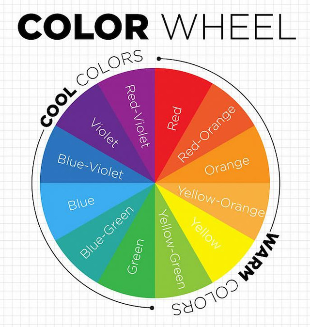
In order to have a successful color scheme it’s important to follow a color harmony group. There are eleven total groups in which you can choose to create a cohesive and balanced space.
- Achromatic – Without color. This color scheme utilizes white, grey, and black to create a crisp and clean look.
- Accented Achromatic – One of my personal favorites, this harmony group follows the pattern of Achromatic, utilizing white, grey, and black but with a pop of a single color. For example, red to create a strong contrast.
- Analogous – When looking at the color wheel, and three colors selected that are adjacent to each other would give you an Analogous harmony. The contrast comes from the variety of tone within the group and creates a monotone but moody space full of depth and interest.
- Accented Analogous – You guessed it… Analogous with a complimentary color. This pop of additional color would be one directly opposite the group on the color wheel. For example if the Analogous group is made up of Violet, Blue-Violet, and Blue, the Accent color would be Yellow.
- Clash – This group consists of two colors. One main color and the compliment would be across and to the left or right. Slightly challenging, this combination is unusual yet creative.
- Complementary – A typical harmony group you would see in most homes. Complimentary schemes consist of two colors that are directly across from each other, for example Blue and Orange. To tone down the intensity, add in pops of white, neutral, or gray.
- Split Complementary – I think you’re getting the hang of this… Creating a more subtle effect, Split Complementary utilizes one main color and two adjacent colors. A good example of this would be Red, Orange, and Blue-Green.
- Double Split Complementary – Instead of three colors, we’re using four! Made up of four colors that use two sets of complementary colors. In order to reduce the intensity, make sure you adjust the proportions.
- Monochromatic – Another one of my favorites! Monochromatic harmony groups use a tint, tone, or shade of one single color. This creates a restful and calm environment. To enhance the overall scheme it would be wise to utilize texture or patterns throughout the space.
- Tetrad – Literally meaning a set of four. Posing a strong similarity to #8, this high contrast group is made up of two sets of complementary colors, which are equally spaced on the color wheel. A great example of this would be Violet, Blue, Green-Yellow, and Orange.
- Triadic – Our final harmony group – using three colors that are equally spaced apart on the wheel. When creating the perfect space you can use the true, bright hue of the color or more subtle tones. Ensure to utilize the third color solely as an accent, as this combination may be highly contrasting.

Leave a comment